The Wikipedia logo is not just an emblem to an online encyclopedia, this is a symbol of knowledge, collaboration and universality. Through the years, the logo was transformed in terms of design and meaning and have become a recognizable sign in Digital culture. In this review, we’ll cover who the Wikipedia logo is, along with its symbolism and history, including the ways this logo portrays the values of the platform itself.
The First Impression of the Wikipedia Logo
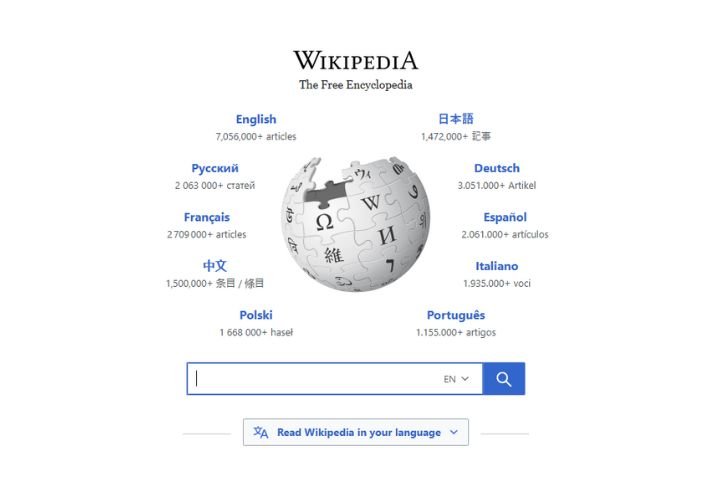
At first look the logo of Wikipedia sent forth immediately atmosphere of incompleteness and curiosity. The globe, made in part using the pieces of jigsaw puzzles implies that knowledge is a work in progress – constant growing, expanding and being refined by contributor throughout the world. The choice of design does propagate the message of spirit of collaboration of Wikipedia, as well as a reminder that the encyclopedia is never complete.
The History and Evolution
When Wikipedia came into being way back in 2001, their logo was one symbol to be experimental and simple. However the early versions missed the point of a knowledge collaborative project. And by year 2003 the now so famous design of a globe was created which had the intent to depict the mission of a globing.
In 2010 there was a huge revamp to the logo. The jigsaw globe was polished and the typography was brought up-to-date and the whole look becoming streamlined. The new one had gotten rid of some of the eye imperfections and had a new cleaner and sharper design which all promised to catch with the growing influence of Wikipedia as a reliable source of knowledge. The re-design was subtle but it was power-packed and it improved the recognition without losing the intent behind the re-design.
The Puzzle Globe: A Symbol of Collective Knowledge
The jigsaw puzzle globe is the focal point of the Wikipedia logo and it’s perhaps one of the most recogniseable is in the digital domain. Every piece of the puzzle bears a symbol on it from several different writing systems, corresponding to the different groups of people who write to Wikipedia. The top portion remaining unfinished is a smart design detail, which symbolizes the notion that knowledge is never-ending, and will never be a perfect “ending” of anything.
This choice of symbolism puts the Wikipedia project in the position of not just a website, but as a living, breathing, global collaboration. The use of several different languages helps to reinforce the concept of inclusivity, as a reminder that knowledge is something that should be enhanced to everyone with no regard to culture or geographical location.
Typography and Wordmark
To compliment the globe, the word ‘Wikipedia’ is constructed in a serif kind, and just like this offers an air of scholarly and seriousness for the platform. The choice of the font, which recall traditional print encyclipedias, is a compromise between modern digital and no-nonsense academia. The tagline “The Free Encyclopedia” embarks upon the tagline’s mission, of providing unfettered access to knowledge to all.
The typography which is a key command in this regard is often neglected too and is vital on building a logo which speaks to the wider readership/researcher. It acts as quasi-tacit message of trust, formality & credibility.
Impact on Digital Culture
Wikipedia logo has become as one of most familiar logo of the internet. Its unique design has set it against the examples of branding of corporate style, with an emphasis on the openness, and not on profit. The puzzle globe to be sure has even been mentioned as a brilliant instance of the way design might represent philosophy – in this case the philosophy of free and open knowledge.
The power of the logo doesn’t just extend to Wikipedia itself: It’s even spawned memes, parodies, educational art projects, which used it to cement its position in the internet culture. Unlike the logos for many institutions with which simply an identifier be used as part of our archive for use by that company, building the logo of the organization that you build for Wikipedia, Wikipedia, there is a strong message for your audience.
Comparing to Other Digital Logos
If you compare that to the logos of other bigger online platforms – such as the colourful simplicity of Google’s logo or cleanliness of Facebook’s typography – the Wikipedia logo’s complexity and depth are front and centre. While most brands are pursuing the minimalist symbols, Wikipedia is an advocate of detail, diversity and symbolism. This approach is an ideal that corresponds to its mission: knowledge is not simple and one-dimensional but manifold, multilingual and constantly changing itself.
The willingness of the logo to embrace complexity rather than minimalism is one of the reasons why they are memorable. Affecting the very nature of the giving contents it vast diverse reflecting and interconnected.
Strengths and Criticisms
Like any other design, the Wikipedia logo has seen its share of both applause and disfavour. Its prowess can be seen in a strong symbology, ascendancy and uniqueness. It is non-corporate or commercial in appearance, so also reinforces non-profit values of Wikipedia.
However, there are some detractors of the design saying it can seem dated nowdays to the scientific nature of minimalistic logos. The complex details of the globe don’t translate to smaller devices sometimes losing legibility. Despite these critiques, because of the logo’s weighty symbolic content, it still remains relevant, despite the sleek branding.
Final Thoughts
An extreme example of a design to serve purpose is Wikipedia logo. It is not only an embellished emblem but is rather a meaningful symbol of collaboration, diversity and endless pursuit of knowledge. Whilst it has been subject to refinements along the way, the basic symbolism has borne out staying true, implanting Wikipedia into the digital world.
By drawing together the complexity of visual elements with the richness of philosophy as to why this logo has been able to continue its status as one of the most important and recognizable emblems on the internet. It has the following message as clear – knowledge belongs to all and the journey of discovery in accumulating knowledge is never over.
Also Read: Techgup org – Shining A Spotlight On The Digital Knowledge Hub